For my pre-production, I am thinking about making a film poster based on one of my favourite books 'Dead to the World' by Charlaine Harris. This is a book based on a teenage girl, Sookie, and the extraordinary life she leads both living in the supernatural world and being a supernatural being herself.
For the film poster I am going to try to create what I think the characters would be like and how they would act, trying to convey their personalities and attitudes through a photograph. As the main character is a teenage girl, I am thinking about using my sister as a model for the picture this should help to convey the characters age and also the target age group and genre of the film. I am also thinking about having a young man or older teenage boy behind her in the background of the picture, this will work as bringing in another character from the book, Eric, but in addition it will create a more mysterious and at the same time dangerous atmosphere for the image - I am going to ask my brother to act as the male.
In terms of location I am thinking about going to Combe Abby and shooting some photos of my siblings in the forest areas and within the trees so that I can convey to the audience the setting for the film and also, as woods normally give connotations of being lost, it being dark and that there is danger, the fact that I am shooting on location in Combe Abby in amongst the trees should help to increase the mysterious air of the image and make the poster look both more professional and like it belongs in the desired genre.
Tuesday, 21 October 2014
Textual analysis of Film posters
 |
| Captain America: The Winter Soldier (2014) Film Poster |
Thursday, 16 October 2014
Textual analysis of Film posters
 |
| Star Trek (2009) Film poster |
Thursday, 9 October 2014
Margin Call analysis
 |
| 'The Margin Call' (2011) |
The lighting through out the film indicates the time of day that the film is set - late at night going into the early hours of the morning - this being mostly low key lighting and a few minutes of natural lighting (morning) towards the end. As a result of this drama and dramatic effect are added to the scenes, this works to draw the audience in and bring interest to the film.
Camera shots are also a good effect in this film as they help to draw the viewers into the scene. A range of different camera shots/camera angles are used, such as mid shots, close ups, medium long shots and hand-held views. These also aid the audience to focus on the characters and the dialogue of the film.
The film contains a mixture diegetic and non-diegetic sound through different aspects of it. Diegetic sounds - such as keyboard tapping, taps and vehicles (cars and helicopters) - reflect both the genre and the area that the film is set it. The non-diegetic sound is the music that they have overlaid over the top of most of the film, this has been used to create tension and a certain atmosphere both to bring the audience in and to present to the audience the severity/the cruciality of the scene.
Tuesday, 7 October 2014
Codes and Conventions in Magazine covers
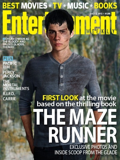 |
| Entertainment Magazines cover on 'The Maze Runner' |
Subscribe to:
Posts (Atom)