Thursday, 11 December 2014

Textual Analysis - Representation of Age 1/3

The Guardian - Friday 28 February 2014
This piece of text is showing a negative view of the generation of new parents. It highlights the fact that the upbringing of children these days is greatly different to that of previous generations. The article mainly talks about the reason for this being that children in resent years are growing up surrounded by technology and different types of media, meaning that they are learning how to use it before they have learnt any real, necessary life skills. "children ages three to five...66% of children know how to play online games and 62% can turn on a computer, but only 14% can tie their shoes" points out that because the parenting age at the moment are already so absorbed in technology, they seemingly forget that it won't be able to teach their children the important things that they themselves can, but also that they appear either unfazed by the fact that exposing their children to technology can have a harmful effect or that they don't actually realise the damage that adverts or other types of media can have on infants and younger children.
The language used within this article is mainly factual, informing the reader of the risks and apparent danger that there is when children are exposed to technology the way they are. However, the opening of the article is written in a way that sounds almost accusing of parents for seemingly forcing this world of technology and media on their children, "More than 90% of children under two have a digital foot print", this can be seen as the author of the article blaming the parents for the children not being able to escape the 'technology web' so to speak.

Tuesday, 21 October 2014

Pre-production plan

For my pre-production, I am thinking about making a film poster based on one of my favourite books 'Dead to the World' by Charlaine Harris. This is a book based on a teenage girl, Sookie, and the extraordinary life she leads both living in the supernatural world and being a supernatural being herself.

For the film poster I am going to try to create what I think the characters would be like and how they would act, trying to convey their personalities and attitudes through a photograph. As the main character is a teenage girl, I am thinking about using my sister as a model for the picture this should help to convey the characters age and also the target age group and genre of the film. I am also thinking about having a young man or older teenage boy behind her in the background of the picture, this will work as bringing in another character from the book, Eric, but in addition it will create a more mysterious and at the same time dangerous atmosphere for the image - I am going to ask my brother to act as the male.

In terms of location I am thinking about going to Combe Abby and shooting some photos of my siblings in the forest areas and within the trees so that I can convey to the audience the setting for the film and also, as woods normally give connotations of being lost, it being dark and that there is danger, the fact that I am shooting on location in Combe Abby in amongst the trees should help to increase the mysterious air of the image and make the poster look both more professional and like it belongs in the desired genre.

Textual analysis of Film posters

Captain America: The Winter Soldier (2014) Film Poster
In this film poster the main focus is the main character of the movie, Steve Rogers (Captain America). As opposed to most film posters where the person in focus is making direct eye contact with the viewer, in this film poster the person is facing away from the audience and is looking towards the floor - giving the audience a view of the characters profile. In addition the background of the image looks gloomy and deserted with a small/distant view an iconic building in America. This can be interpreted to be that something has happened and that whatever it is has cause a lot of destruction - meaning that as a result the main character has a solum face. This idea that something bad/upsetting as happened is further enhanced by the darker colours and tones that they have used in the image as there aren't any bright or cheerful colours. As in the previous film poster, the title of the film is in the largest font followed by the date of release and ten the smaller typeface for the details on who the producers are.

Thursday, 16 October 2014

Textual analysis of Film posters

Star Trek (2009) Film poster
This is the film poster for the 2009 Star Trek reboot film. In this poster there are pictures of the main characters in the film, the title, a scene that is from the film, and details about the director, producers and when the film will be released at the bottom. The colours are mainly blues and blacks - other than the red of the fire on the Enterprise in the background - this can have colour connotations of space but also of action, as the colours are dark and blend in well with each other. This therefore makes the film look more like its a serious film than a comedy. The fact that the title of the film is in one of the only colours other than blue and black (gold) makes it stand out a great deal more than if it was in the same colours as everything else. In the background of the poster, Uhura - the woman - is the only one that isn't facing forward, this could have connotations to the fact that she is more mysterious than the other characters in the film and on the cover.

My media course work survey

https://www.surveymonkey.com/s/B7JBC9K

This is my survey for the media project!

Thursday, 9 October 2014

Margin Call analysis

'The Margin Call' (2011)
This film is aimed at an audience of business men and office workers, as it is based on the discover f  downfall in profits in a company and how that will affect those who work there. The miss-en-scene of this film are mainly the suits that the characters are wearing - indicating that they are office workers/business men and women and also that they have high paying jobs - and the setting of the film - New York in a multi-story office block, containing scenes on the floor, in the bathrooms, in the meeting rooms and some scenes just outside on the streets or on the roof.

The lighting through out the film indicates the time of day that the film is set - late at night going into the early hours of the morning - this being mostly low key lighting and a few minutes of natural lighting (morning) towards the end. As a result of this drama and dramatic effect are added to the scenes, this works to draw the audience in and bring interest to the film.

Camera shots are also a good effect in this film as they help to draw the viewers into the scene. A range of different camera shots/camera angles are used, such as mid shots, close ups, medium long shots and hand-held views. These also aid the audience to focus on the characters and the dialogue of the film.

The film contains a mixture diegetic and non-diegetic sound through different aspects of it. Diegetic sounds - such as keyboard tapping, taps and vehicles (cars and helicopters) - reflect both the genre and the area that the film is set it. The non-diegetic sound is the music that they have overlaid over the top of most of the film, this has been used to create tension and a certain atmosphere both to bring the audience in and to present to the audience the severity/the cruciality of the scene.

Tuesday, 7 October 2014

Codes and Conventions in Magazine covers

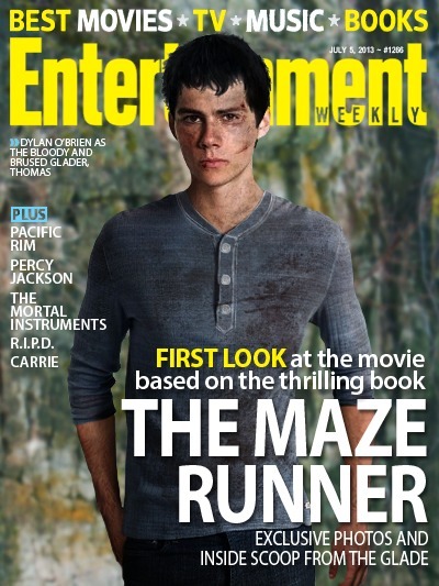
Entertainment Magazines cover on 'The Maze Runner'
The main image on this cover of Entertainment Weekly is of Dylan O'Brien for his new film 'The Maze Runner' (coming to cinemas on October 10th 2014). A key aspect of most main images for magazines which is shown here is that the model usually makes direct eye contact with the reader. The fact that the picture of Dylan O'Brien is covering part of the magazines name (the masthead) shows that it is well known enough that the name doesn't have to be completely visible for it to be recognisable. The representation that is being given off from the front cover of this magazine is that it is aimed at an audience of film, television, book and music loves - not only do we get this idea from the slogan 'best movies*TV*music*books' but also from the masthead of the magazine 'Entertainment Weekly' and from the fact that the main image and cover line, focusing on one of the new films that is coming out. The age range for the magazine can be quite varied - as can the audience group (a, b, c1, c2, etc) - because people from different social integration's can have a common interest in films and other types of entertainment, however because of the topics that are shown in the cover lines (naming some other films that appeal to a younger age e.g Percy Jackson) the audience is probably in the age group of 13-25 and the audience demographic is most likely d and e (being students and those of a more average income) as they are more likely to spend some of their spare time going to the cinema or listening to music. Another group of people who are likely to buy this magazine are teenage girls because of the main image being Dylan O'Brien and the fact that he is seen as attractive and that he's popular among that age and gender group.

Tuesday, 30 September 2014

The reading of Peaky Blinders

The head gang from the programme 'Peaky Blinders'
http://www.bbc.co.uk/programmes/p01fj94w

The programme Peaky Blinders is aimed at an audience of an older age group but also at people who would appreciate the kind of era that its set in - people who have either experienced the time or have an understanding of what the time was like.

The oppositional audience would be parents or younger people who may take a bad influence from the series or may take a bad idea of what the people of that time were like and form a negative opinion on them - not understanding the historical context that the series is put into.

The negotiated audience would be people who did not know much about what happened in that time but who have some idea of what was going on. These may take away the idea that people of the time were violent and aggressive but also understand why they acted that way - to protect others and regain control of their lives.

Monday, 22 September 2014

TV show construction

Jay James sings Say Something by A Great Big World - X-Factor audition week 1
The X-Factor is an example of how the media is constructed to entertain the audience and to appeal to and influence the audience in different ways. This video shows how the editors of the X-Factor have selected certain individuals to show to the public/audience, they have obviously shown Jay James because of his looks - he will be seen as attractive to some of the audience - and because of his back story. The reason that these factors make a difference in who gets shown or not is that, the more appealing the persons looks or the sadder the 'sob story' the more entertaining it is for the audience who are watching it at home. The camera people have also made his story more effective by showing shots of the family watching him on the screen, to add a more emotional aspect to the performance.

Sam Bailey sings Listen by Beyonce - X-Factor audition week 1
The audition of Sam Bailey is also an example of how the editors of X-Factor have constructed the programme as when she is singing, the camera people show shots of the judges faces, of her partner watching her from backstage on the screen and also of some of the other contestants turning to face the screen after hearing the sound of her singing voice. This constructs the show for the audience so the know how good she evidently is and how much of a surprise she has taken the others - both on the judge panel and in the audition waiting room - this has in addition added an emotional aspect to this performance as well and tries to affect the audience sitting at home by showing that not only is her job something you would't expect someone with a voice like hers to have but also to give her a sob story as well.

Saturday, 13 September 2014

Gender presented through the media

Ouran High School Host Club
The anime TV series Ouran High School Host Club is an example of gender representation in the media as the main character Haruhi Fujioka explains that she views gender as 'not something that you should judge people on, but something that you should recognise as a part of them', meaning that we shouldn't stereotype genders as they don't describe what kind of person you are.

In the show, Haruhi is a girl who chooses not to design her looks on what people would describe as feminine and instead dresses in whatever she feels like. She also explains that she has short hair as she got something stuck in it and it was just easier to have it all cut off. The way the characters act is not how you would assume people of that gender would act either, showing that the stereotypes of genders are incorrect and give a wrong impression of how we should treat people because of them.

Sexuality presented through the media

The Naked Civil Servant (1975)
Sexuality is presented in many different ways through the media, in both negative and positive views. The Naked Civil Servant is a TV movie about the life of Quentin Crisp (born Denis Pratt) and how he dealt with his homosexuality in the 60s when it was seen as completely outrageous and wrong. 

The film targets how those who practised or revealed their homosexuality were treated and seen as strange/unnatural, and also how Quentin was very open about his sexuality and acted flamboyantly without caring for the criticism that he got.

Age presented through the media

The Quartet (2012)
The film The Quartet is a good example of how the media presents age and elderly people as it goes against the stereotype that they are in constant need of care and attention. It in fact shows them as being strong, independent individuals who have power over their own lives.

The tokenism way of presenting old age is someone who is in a care home or needs assistance from their family or someone assigned to help them. The Quartet is one of the few films that shows what most elderly people are actually like, independent, happy and trying to live life to the full.

Class presented through the media

The Telegraph on the Duke and Duchess of Cambridge's second child
Class is shown in the media through the royal family. Most of the articles that include or are centred around them tend to use positive and flattering language when mentioning the royal family. This shows that not only do most people have deep respect for them but also that because they are in a higher class - upper class - than most of the people that read about them - working class - the media may find it necessary to only praise them as if they presented the royal family in a negative way, not only would they loose some of their audience, the may be sued as a result.

Newspapers also cover the views of the people around the royal family, this article is a good example as it shows that the 'students and staff shouted their good wishes' to the Duke and Duchess of Cambridge, showing that the public think very highly of the royal family and respect them.

Thursday, 11 September 2014

Race presented through the media


The Big Bang Theory
 An example of race shown in the media is The Big Bang Theory in which Raj is presented as a stereotypical Indian man, insulting his own culture, being unable to speak in front of or to women, and stating things that are unrelated to a religion which he supposedly follows.

The stereotyping that is present in this program is known as 'Tokenism' and is a way in which the media shows these types of stereotypical people to their audiences. It can create wrong impressions of people that others will believe which can unfortunately lead to racism or discrimination.

Wednesday, 10 September 2014

Favourite TV show

Supernatural season 9 opening title sequence
My favourite TV program is currently Supernatural which is shown in America. It is based on the lives of two brothers, Sam and Dean Winchester, and their escapades: hunting down and killing supernatural beings that are causing harm to the lives of humans all around the country (America). Over the years there have been a total of 9 seasons filmed and broadcast, the 10th season being made at the minute and scheduled to be aired on October 7th 2014.

Supernatural has a great deal of graphics to add to the already filmed scenes as some of the creatures the have to face need to have them, in addition to the make-up and prosthetics, otherwise they wouldn't be able to be included (beings such as demons, angels and leviathans). Also the writer and crew at Supernatural create a completely different title sequence for each of the seasons.