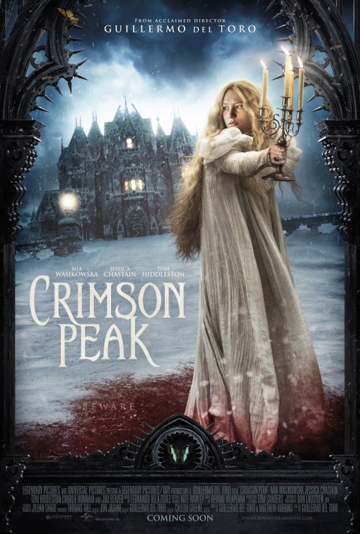
Visual codes: The woman in the foreground is wearing white connoting to purity but in contrast is surrounded by blood stains on the snow around her. In the background there is a gothic looking house. This use of iconography means that the audience automatically makes the connection to the horror genre. The mise-en-scene of the weather in the background connotes to the horror genre as well because it shows a storm. However the fact that it is a snow storm reflects the isolation that the woman in the foreground - judging by her facial expression - feels. The mise-en-scene of the snow storm and the gothic house means that the colour scheme of this film poster matches that of those in the horror genre. The use of 'Rule of Thirds' in this film oater means that the viewers eye is drawn firstly to the figure, then to the mansion in the background, and finally to the title of the film, this sets up a number of enigma codes for the audience: 'Where is she?', 'Why is she on her own?' and 'Why is she surrounded by blood?'.
This film poster also shows connotation to danger, not only through the reds and dark colours, but also through the spikes that are visible on the gateway/archway. On the archway we can see the only other signs of life that are in the film poster, moths cover the spikes and the metal. There is, in addition, a small butterfly on the left side of the archway, this could connote to the fact that the woman is the only pure thing in the area. The font used n this film poster also shows the genre of the film as the gothic theme that we see through out the poster is evident in the font.
No comments:
Post a Comment